Mobile Donation App
DŌNŌ
informed donations made easy
"The user reviews and organization information really helped me make the decision I did in choosing an organization...this platform makes the donating process simple and seamless."
TEST OUT DONO NOW!
PROBLEM STATEMENT
The research process for donors is time-consuming and inefficient when ensuring an organization is reputable.
HYPOTHESIS
Developing a centralized research platform that allows donors to efficiently see an organization’s information, ratings, and reviews will provide assurance to donors and increase donations.
- TIMELINE
- 8 weeks
- (featured project as part of my part-time UX Design cohort with General Assembly)
- ROLE
- UX Researcher
- UX Designer
- UI Designer
- TOOLS
- Figma
- Miro
- Maze
- Adobe Illustrator
- METHODS
- User Interviews
- Affinity Mapping
- Persona Development
- Journey Mapping
- Feature Prioritization
- Sketching
- Wireframes
- Rapid Prototyping
- Usability Testing
- Iterative Testing
How could I improve the user's journey in donating?
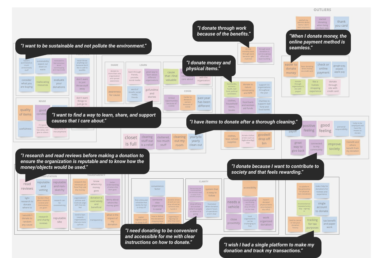
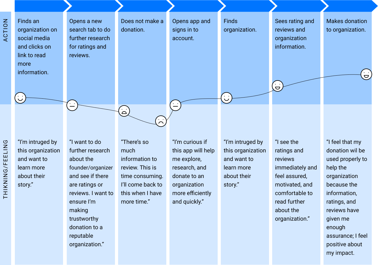
I interviewed 5 donors who have made donations within the past year, both monetarily and in physical items, to understand their complete user journey in donating. By synthesizing the research, I was able to find trends in users' emotions, goals, and painpoints.
How might we help donors feel secure in making donations to trustworthy organizations?
Through user research, I generated 2 personas to map out their goals, frustrations, and shared painpoints of being a donor.
JAMIE, 30
"I want a system that is easy to follow to make and track my donations."
KENNEDY, 25
"I dislike discarding unwanted items in the trash, but finding a reputable donation center is difficult."
How and why are we designing?
DEFINE
what is already working in the donation process:
- the web/mobile payment process is seamless
- people view donating as an altruistic act
- people want to connect and support others
ESTABLISH
the goals of end users:
- create a centralized research platform that is time efficient
- instill trust in donors
-
INCREASE DONATIONS
- increase organizations' resources
- maximize donors' impact
IDENTIFY
the shared painpoints from the two personas:
- researching organizations is unorganized, time-consuming, and overwhelming
- no existing mobile donation platform to efficiently explore, discover, and research organizations
- users want to contribute to society and their community by donating, but don't know where to begin
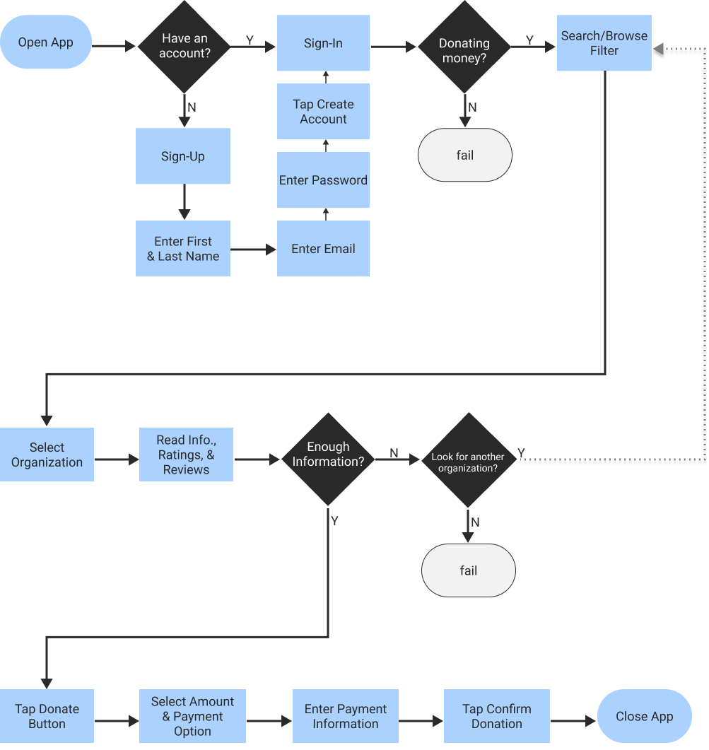
Building the MVP
After sketching, I used the 2x2 matrix and MoSCoW method to hone in on the main features of my MVP. I shifted my focus to prioritizing the monetary donation process because money is most resourceful and convenient for organizations to accept.
While replaying portions of the user interviews and reviewing my notes, I concluded that my focus should be on improving the research process. During the research process, potential donors were dropping off, due to the extended timely and unreliable research they’d have to conduct on their own.
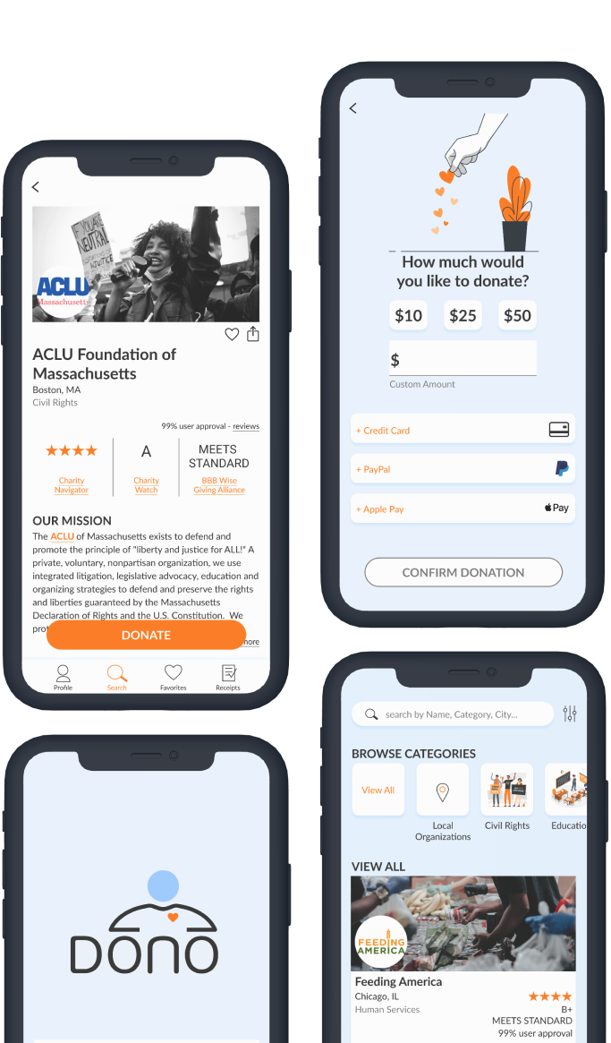
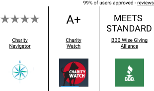
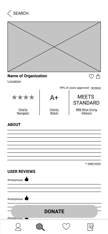
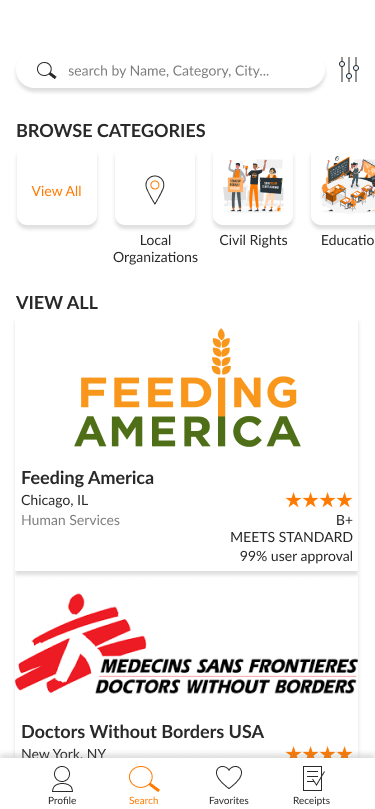
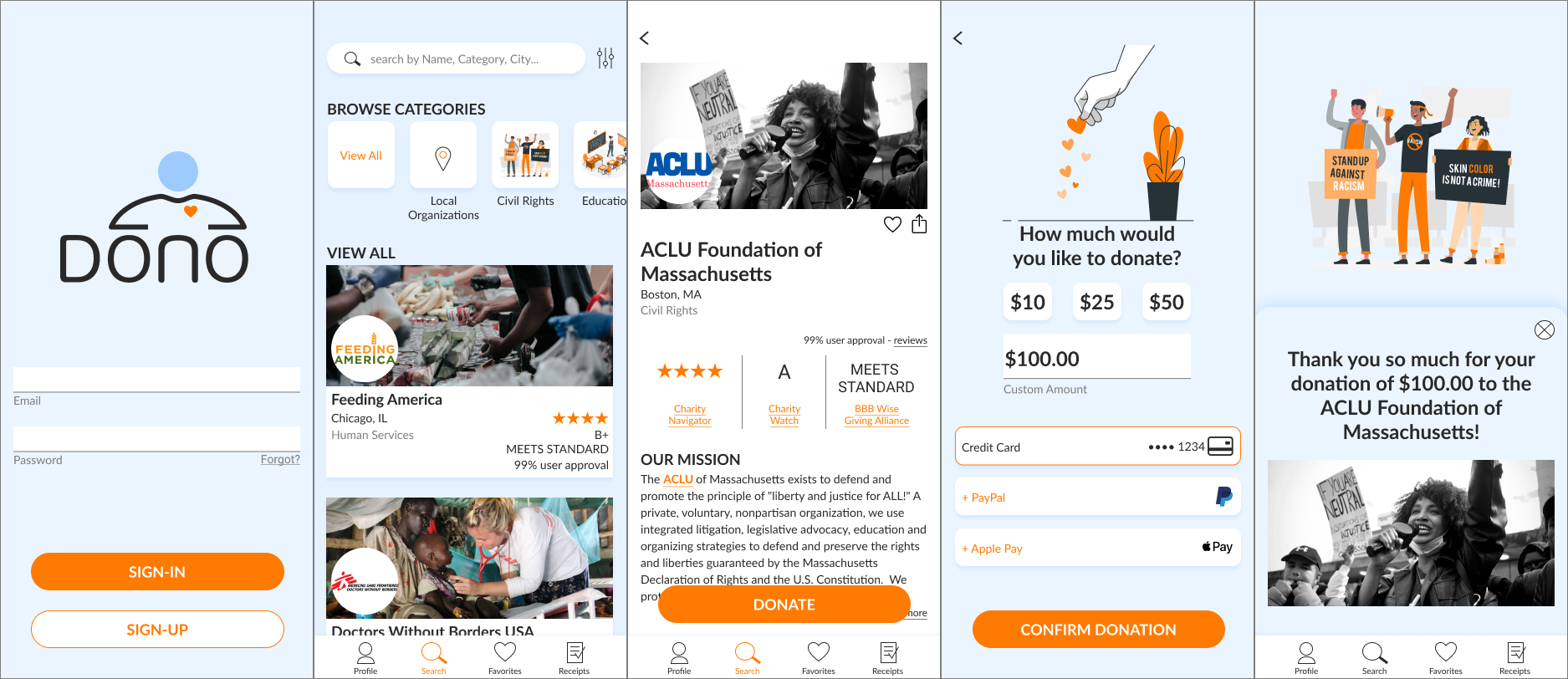
Upon further research, I chose three charity auditors that people frequent when researching organizations: Charity Navigator, Charity Watch, and BBB Wise Giving Alliance. By selecting these well-established and credible sources, trust is instilled in my design, providing assurance to donors when they donate.

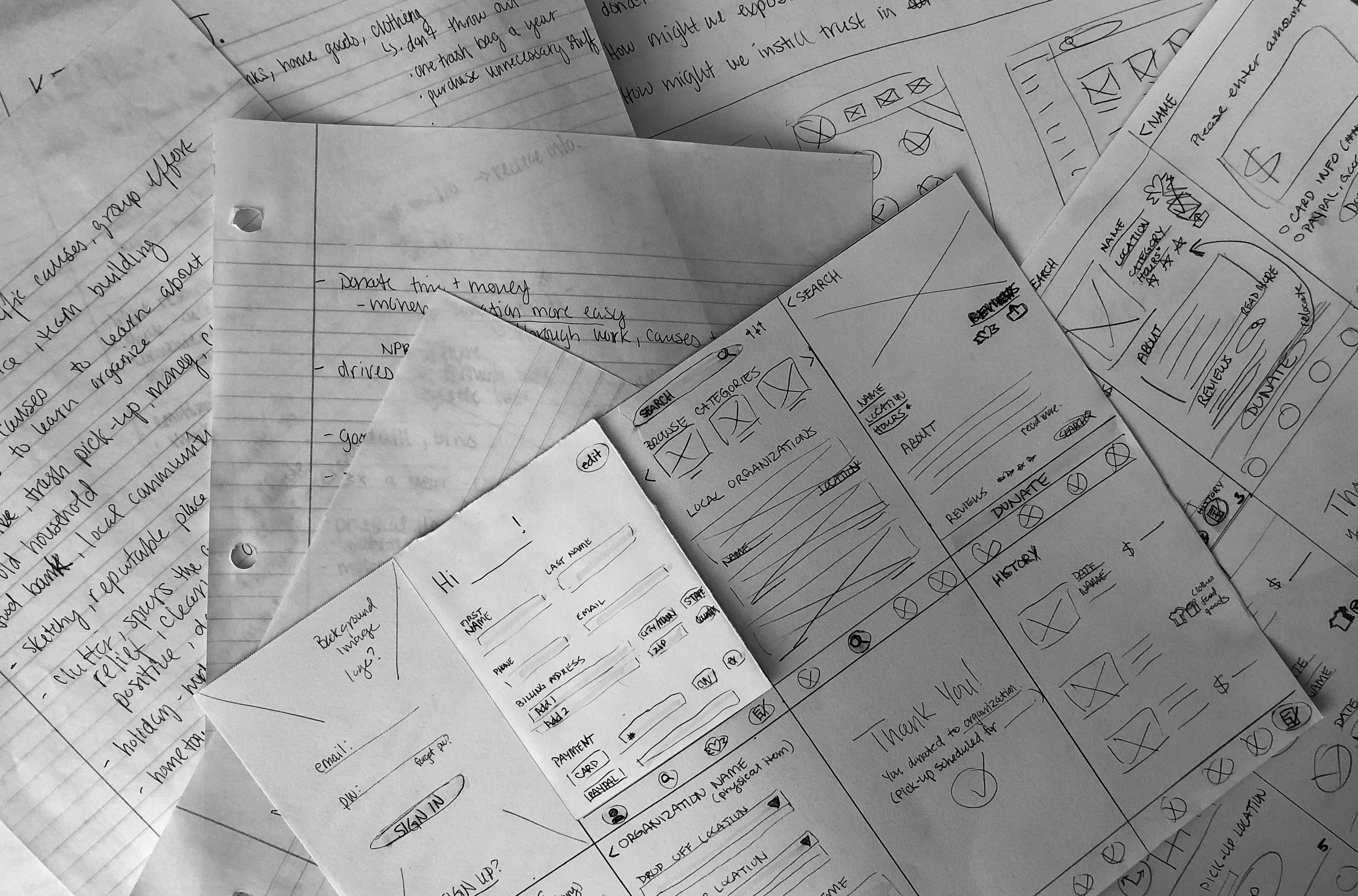
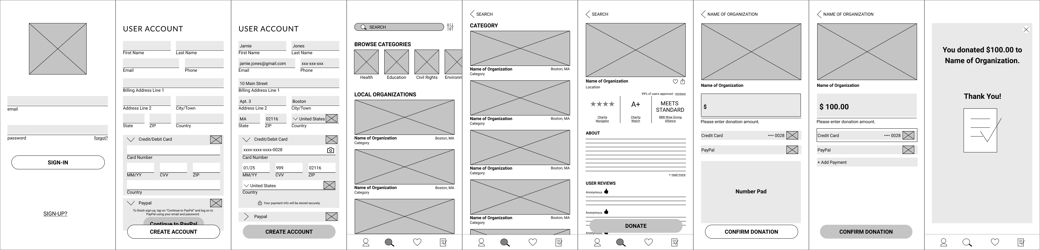
Usability Testing Low-fidelity wireframes
I conducted 4 remote usability tests to understand if the prototype met the goals of the donors and solved their painpoints. Testers were screened to fit the target user.
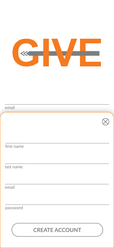
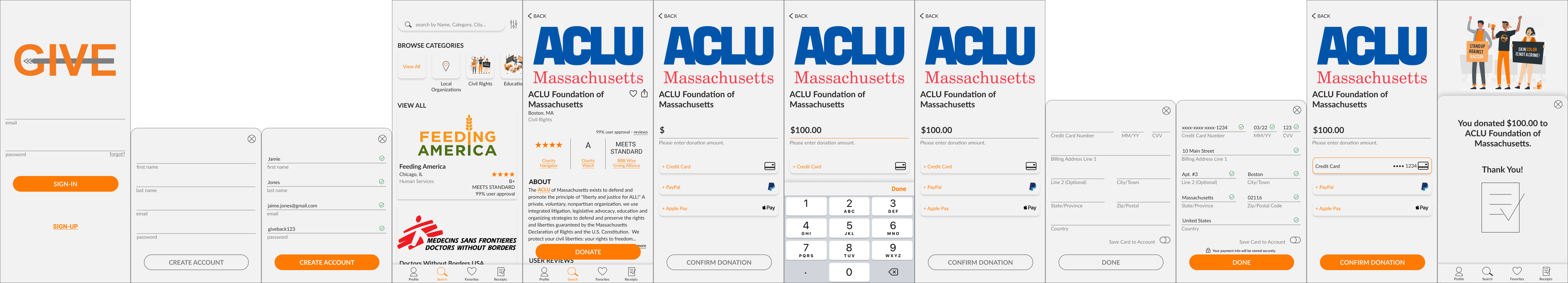
1. Sign-up.
- A platform that asks for donors' billling and payment information only once to process all their donations.
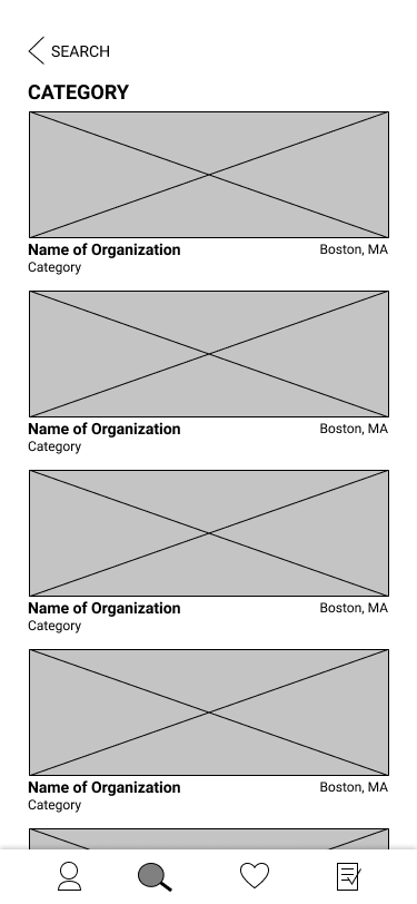
2. Browse and Research.
- The ability to quickly research and read reviews in a centralized location to ensure the organizations are reputable.
3. Donate.
- Quick and seamless check-out process.
1:10 min
avg. completion time
100%
of users completed all the tasks
100%
of users would continue using this app
100%
of users agreed the ratings and user reviews were helpful in making them feel secure to donate
100%
of users agreed the ratings and user reviews helped researching an organization simpler and quicker
Iterating: Recommendations and Action Items
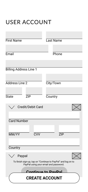
Account Creation: Payment Information
- Severity: Critical
- Action & Solution: The account creation screen will remove the billing address and payment input requirement. The user will have the option to add and save their billing and payment information during the donation check-out screen or when they click the profile icon to access their profile account.
- High Impact: By making the change, trust in the app increases because users do not have to provide personal information immediately at account creation. The change expands options for the users and allows them to have control of their personal information on the app.
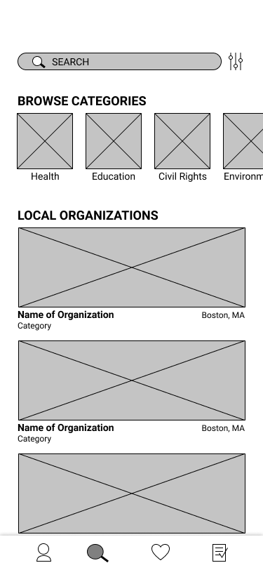
Search Screen Scroll
- Severity: Minor-Cosmetic
- Action & Solution: Keep category carousel at the top, add 'view all' card, and make 'local organizations' a category card. When the user clicks on the category, populate the screen with organizations of the category on the same screen.
- High Impact: By making the change, users are able to quickly scroll through the carousel while options populate below the selected category card, which eliminates the navigation to a new screen and back button.
Ratings and User Review Optimization
- Severity: Minor-Cosmetic
- Action & Solution: On the search screen while browsing, allow the users to see the ratings and user review approval on the organization card.
- High Impact: By making the change, users are able to see that key piece of information quicker, eliminating an extra click to navigate to the organization screen.
"Removes a lot of the research if you trust those ratings websites."
"I think reviews and ratings make things a lot better. It makes sure what you are donating to is a reliable source."
"It is a seamless application, works out a lot better than other standard charity giving platforms."
"If you go to an actual charity website, them using a third party like this will help them get more donations."
Testing Mid-fidelity wireframes
For the second round of testing, I utilized MAZE to conduct 7 unmoderated usability tests to gain further data on usability, fuctionality, and validity of my MVP.
All testers completed the tasks successfully and found the app to be intuitive and seamless to use. The ratings and reviews efficiently helped donors in making quick, informed decisions while donating.
100%
DIRECT SUCCESS
72-100%
USABILITY SCORE
9.3-16.5%
MISCLICK RATE
6.9 seconds
AVG. DURATION of BROWSE & RESEARCH
72%
USEFULNESS of RATINGS & REVIEWS
*remaining 28% neutral
86%
CONTINUE USING
*remaining 14% neutral
"I would like to learn more about the organizations and how they will use the funds."
"The user reviews and organization information really helped me make the decision I did in choosing an organization."
"If I started donating to the charity using the app, it would definitely incentivize me to continue using the app since the experience felt seamless."
"Love this idea, I have made donations to similar projects, and it involved a lot of clicking multiple links to find/get to the actual donation page. This made it simple and easy, all in one place."
Storytelling with Branding and UI
I shared my designs and prototype with a group of UX/UI designers to gain additional feedback on the branding and UI elements. The logo and lack of imagery with people were questioned.
Since donating is a personal experience, I wanted to ensure donors felt at ease and connected while donating. I changed my logo to be more readable and approachable, updated the entire UI with a softer light blue background, and increased the imagery of people by switching out the cover photos of the organization. By making these edits, my aim is to tell a thoughtful and connected story while the donor navigates the app.
Takeaways
The UX process allowed me to build an MVP that solves the donors painpoints. By instilling trust and providing assurance, people can donate with a peace of mind and focus on seeing the impact of their donation, rather than question the motives on where and how their money is being used.